On this page, you will find the drafts we did for our movie poster and movie magazine front cover. Only one front cover and movie poster will be chosen as one of our final choices.
MOVIE POSTER DRAFTS
Below are different existing magazine posters, that we have chosen to use as a guideline for our magazine poster on our final products. What really made us to choose these posters is mainly the layout and the caption of the main image as it provides the connection with the audience. As a result; many people would be interested to know more about the film by going to watch it.
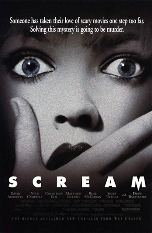
This poster shows the image of a woman being in a shock. This can connote to the reaction of the audience when or after watching the film. What attracted us from this poster is the main image and the text layout.
|
Using the effects when creating movie posters is one of the things that we found interesting. This is because it gives a more attractive look comparing with if you use the original image only.
|
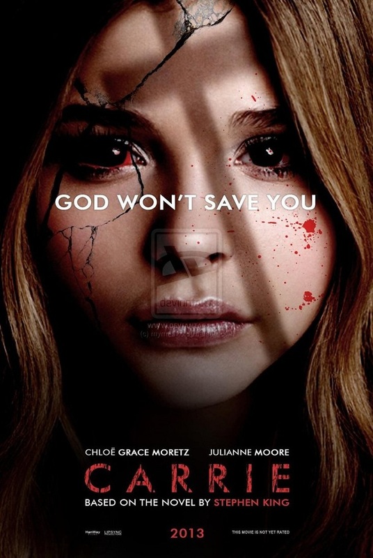
While planning for the ideas one of the things that interested was using blood splash on the face of the main image. therefore i believe this poster is an example of this.
|
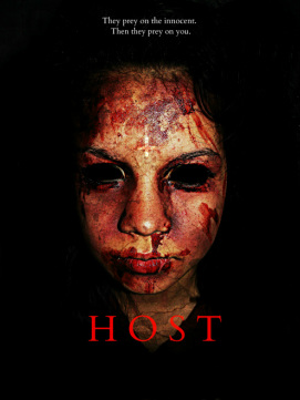
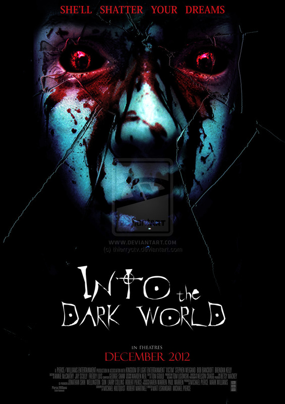
This is one of our favourite poster because it matches with ideas that we have on how our final magazine poster the darkness behind it gives the audience the fear of evil.
|
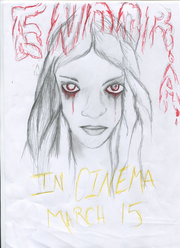
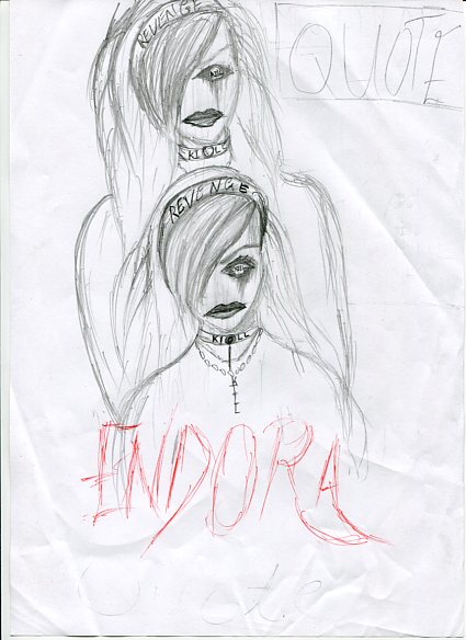
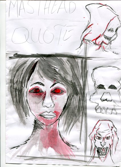
Down Below are four drawn drafts designs of our magazine movie poster. There are four of them but at the end only one of it would be used as our final product. According to the audience research that we conducted, most people preferred the first drafts because of its structure or layout.
|
|
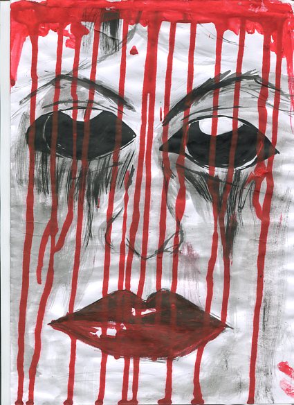
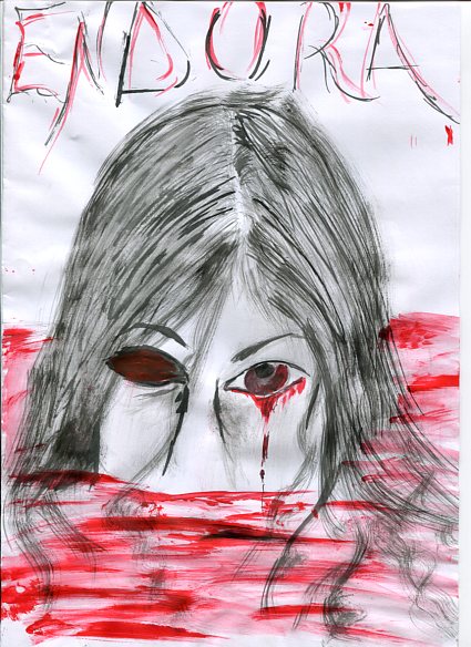
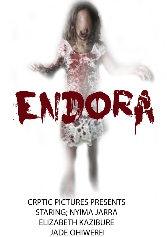
These two designs were one of our favorites. this is because we liked how the images stood out especially the first one and the make up looked very weird and creepy which was the thing we were aiming at, as this would be the main attraction to the audience. at the end we wended up choosing number one as the final design for our movie poster which is one of our final products, even though we did change the text layout also the type of font to use.
|
|
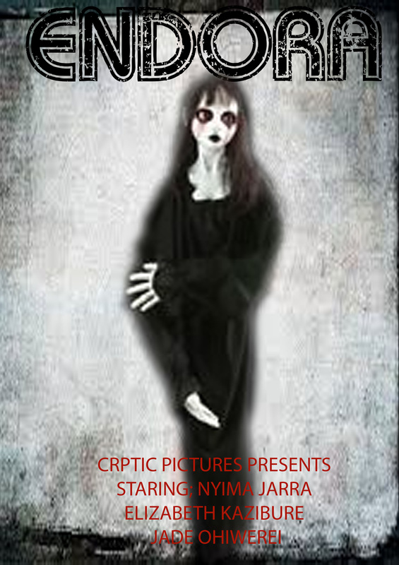
These were also our poster designs, unfortunately they were not one of our best but we did consider to use them if everything didn't turn out as we wanted to. the most likely that we thought could possibly torn out into a good poster was number 3 because we believe that the whole idea of her rising in a blood pond would be quite good if it will be well constructed. However we would consider poster 4 but that would be our last option as we didn't really like the double reflection idea but we thought we would give it a shot.
|
|
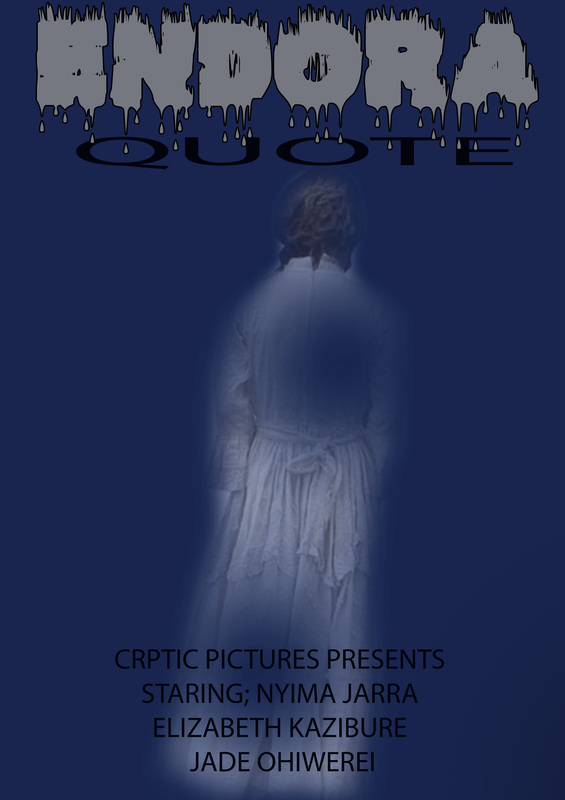
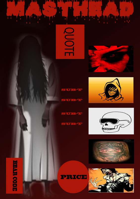
As a team we believe that it is to put our ideas together and try them using different elements to make them come alive. these were one of the two ideas that we did on the computer about our movie poster. we used different colors and effects in order for us to know which elements are good and which ones we be definitely be using on our final products.
|

|
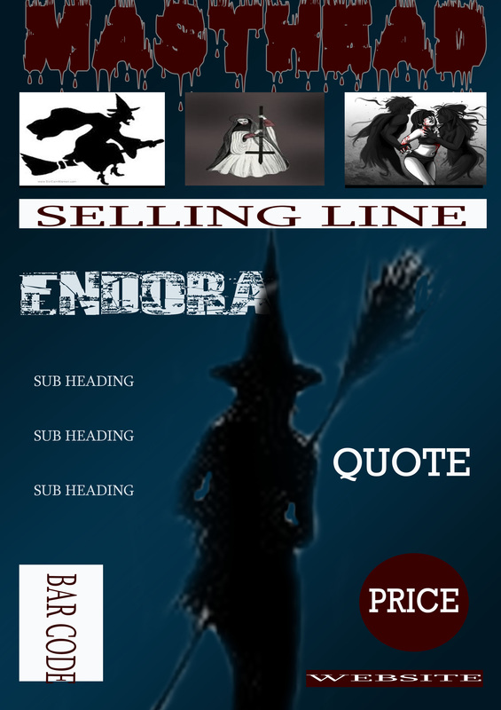
Also these were other ideas that we had about our movie posters. in these ones we decide to take pictures that we took by ourselves and throne from the internet and then combine them together to see if it will make a good work.
EXISTING MAGAZINE FRONT COVERS

The image on this magazine front cover is probably the main thing that attracted us to it. this is because it gives the audience a horrific feeling to the audience that can lead them to want to know more about the film.
|
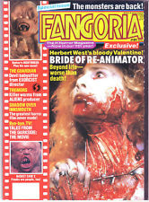
The colour scheme of this front magazine is quite unique and different. This is very good because it is different from most of existing magazine covers.
|
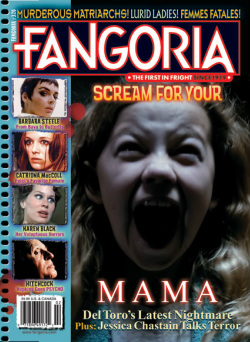
This is one the best front covers that we preferred mainly because of the layout also the image is very eye catching. similarly the writing is very well structured.
|
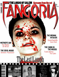
The main imagine of this magazine is ver good because it matches with the main tagline but also gives a message to the audience on what the main film is mainly about.
|
MOVIE MAGAZINE FRONT COVER DRAFTS
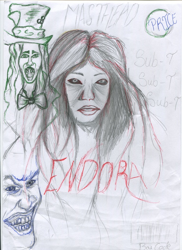
Below are our drafts designs for our magazine front covers. some of these were drawn by hand and some were developed using Adobe Photo-shop. the structure are supposed to give us an idea on how our movie magazine front cover would look like.
|
|
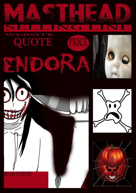
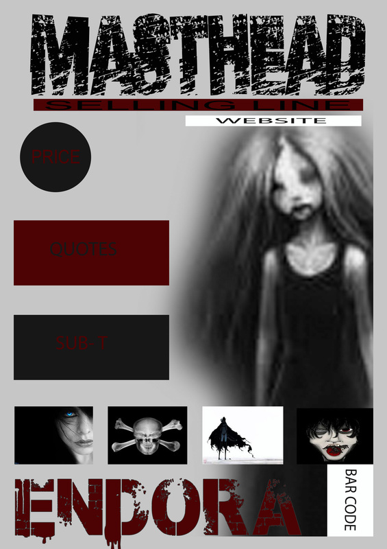
These magazine design were specifically designs on photoshop. the whole point for this was to get a idea on how we would want our magazine posters to be structured. these included the font of the masthead, what gender would the main image be, the colour scheme and other important factors.
|
|
These were other magazine front covers that we designed. in this we tried to arrange the images any how just to match to see if it will give any effects or give us any ideas that will lead us to produce a successful magazine front cover.
|
|
