HOW EFFECTIVE IS THE COMBINATION OF YOUR MAIN PRODUCT AND ANCILLARY TEXTS?
In this question we explore how effective the use of for example, different forms of advertisement and Synergy collectively made a significant impact on the success of our final products.
To use an example, we have picked the Horror movie Saw to explain how it's continuity was effectictve on the Movies franchise.
To use an example, we have picked the Horror movie Saw to explain how it's continuity was effectictve on the Movies franchise.
SAW


The posters follow a theme of using body parts which is consistent with the whitish background and the body parts are in low lighting and seem to be either mutilated from ones body or appears to be discoloured. The font used is the same and the background again is not busy and relies on the main image to be dominant. Simalarly to the trailer at 0:01 seconds we see a television screen with the trademark 'Saw' doll on the screen on the trailer, also again in the trailer of Saw II, following from a recap on what happened in the previous movie we are again greeted with the same doll on the television screen. The backgronnd is ogf low lighting leaving the twisted smile of the doll to be domianant and embedded in our minds.
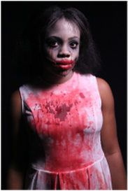
Simialrly to Saw, we too tried to incorporate a dominating feature in our final products. This was the bloody smile and the blood seeping from Endora's Father.


To make our Poster and Magazine Cover a success we had to enforce the low lighting consistancy as like to Saw, the main image is meant to more dominant causing the audience to look in shock and see the abnormality in the image. The right side of our models eyes are de-saturated. This de-saturation follows almost to the whole half of her face only allowing the left eye to be visible but not the pupil. The whiteness of her eye is also discoloured to a dirty white but yet it is still bright enough to stand out on her face. The bloody smile is also dominant in the picture. This correlates to the Magazine cover to the as the same half of her face is de-saturated, the main lighting again is low and the bloody smile is gory. However because we didn’t want everything to be the same as this may be a tad boring we blackened her eyes and added a speck of white to form a gleam from her glossy black eyes.


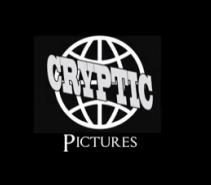
The Logo was a piece of our final piece that we found a bit difficult as we wanted to make our label unique but eye-catching at the same time. But here they are:
LOGO


Our logo ‘CRYPTIC PICTURES’ was inspired to us from the networking logo ‘Motion Picture Association Of America' as its a very popular logo which is seen on the credits of major movies.
For the costume we wanted to make it plain and dull but at the same time hint the dirtiness and turmoil of Endora. We eventually chose a plain, white, knee high, sleeveless dress and doused it in blood made from the red food colouring and maple syrup to give it that gory, sticky and shiny appearance.
COSTUME
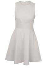
We concluded with the above dress, which we believe achieved and captured the chararcter of Endora. Below is how it fitted the chararcter after being soaked in the blood.
For a successful movie it is imperative to branch out many unconventional ideas to advertise your film for example:
BUS-STOP


WEBSITE


CALENDAR


YOUTUBE


FONT
For the font we downloaded it from the website dafont.com. This enabled us to browse through the thousands fonts they had and to pick one that would make our products unique. The fonts available to us from Photoshop and word were quite limited.


For the credits at the bottom of the poster that tell you who the Director/Producer are and what company created the movie we used a font called 'Steel Tongs’ to achieve that from Dafont.com.


