HOW DID YOU USE MEDIA TECHNOLOGIES IN THE CONSTRUCTION, RESEARCH, PLANNING AND EVALUATION STAGES?
In cryptic pictures media technologies has been a major help from the start of our project to the end. The use of media technologies has also resulted to produce the best final pieces as possible. Technology in today’s day and age would be considered one of the most intense factors of many teenagers and adults life’s, with this in mind it is important that we can take full advantage of this and create products that can impress our audience and allow them to believe that our products have the potential to actually pass for a professional magazine, poster and trailer.
Planning & Research (Development + pre production)

|

|
In Cryptic pictures website technology was one of the important things that was very useful. Weebly(an American web-hosting service that features a drag and drop website builder.) was the website that we used to upload every bit of our coursework. This is because it enabled us to present our work in a professional and, tidy manner as much as storing as much information during our journey to produce the final products.
We
as a group are very fond of Weebly, as we have been using it since our first
year of AS. During this time we have preferred how the accessibility of the
structure works with our effort, therefore it enabled us to present our work in a clear,
creative and concise manner.
As leaders of cryptic pictures, we felt that the presentation and appearance of our site is very important as it has to withhold an eye-catching, visually pleasing look to show our audience that we have thought about everything when it comes to showcasing our products and research we have taken out from the beginning of the course.
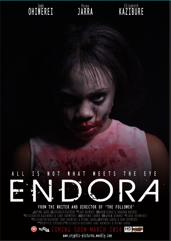
Our task was to create a horror movie poster, magazine front cover and trailer. As a result of this we thought that the colors needs to be a bit scary and abnormal, therefore we went with the color scheme of black, red and white which connotes danger, fear and mystery;something that we believed that it should flow in all of our three final products; As they are likely to be used in the creation of horror movies. When we were creating the logo we wanted to go with a color that’s quiet warm dangerous fearful and subtlety; therefore we went with the colors red and black. The font of our name “Cryptic pictures” is different from the font of our final products; as we wanted it be quite unique and different also challenge the normal layout. our other main of the font is that we wanted it to be very eye catching to the audience of any age as this would make them see our products.
As leaders of cryptic pictures, we felt that the presentation and appearance of our site is very important as it has to withhold an eye-catching, visually pleasing look to show our audience that we have thought about everything when it comes to showcasing our products and research we have taken out from the beginning of the course.
Our task was to create a horror movie poster, magazine front cover and trailer. As a result of this we thought that the colors needs to be a bit scary and abnormal, therefore we went with the color scheme of black, red and white which connotes danger, fear and mystery;something that we believed that it should flow in all of our three final products; As they are likely to be used in the creation of horror movies. When we were creating the logo we wanted to go with a color that’s quiet warm dangerous fearful and subtlety; therefore we went with the colors red and black. The font of our name “Cryptic pictures” is different from the font of our final products; as we wanted it be quite unique and different also challenge the normal layout. our other main of the font is that we wanted it to be very eye catching to the audience of any age as this would make them see our products.

The social network perspective provides a set
of methods for analyzing the structure of whole social entities. In the world
of today social networks play a major role in our daily lives. As it enables us
to connect with our loved ones, family and friends. As a result of this, us cryptic pictuters decided to use a range
of different social networks such as Facebook and Whatsapp. We used these three key major social networks to conduct our
audience research. We found them very useful as a range of audiece managed to
respond our survey. This led to us having a good validity
informations about our final products. It also helped us to provide on
the key information about what the audience would want to see in these magazine
front cover, movie poster and movie trailer.

WhatsApp Messenger is a smartphone messenger available for Android and other smartphones. WhatsApp uses your 3G or WiFi to message with friends and family. Uing whatsapp we were able to conduct our audience research and get succesful feedback.
|

Facebook is an online social networking app. facebook was where we had the most responses as most of our target audience were likely to have it and therefore saw our questionnaire which led them to reply.
|

Google is an American multinational corporations specializing in Internet-related services and products. Google played a big part on completing our final products. It gave us a range of different magazine front covers, posters and trailers that they could be our guide on creation our own media products(poster, trailer and magazine front cover. in addition google helped us to to research about our final sub genre choice so that we can know and learn about it and give us a structure of how we could base our own ideas according to this sub genre. Further more it enabled us to see different range of images of movie posters and magazine front cover that we could pull out some sort of techniques that could quite useful on our final products.
YOUTUBE

Youtube is a website where you can share any videos with the world. our group found it very useful as we were able to view work from past students and from real existing horror trailers to gain more experience and techniques that we could use on our poster for example what colour scheme we should use. By using youtube we poked different horror movies that associated with our mixture of two horror sub genre "slasher" and "supernatural". Examples of movies that we watched and experienced how they used their techniques were "Carrie" and "Insidious". From these we got many ideas especially the carrie trailer because it gave us an idea of what shot should be used on the poster's main image also we used the family idea from insidious but we twisted it a bit. Carrie also had similar conventions on our main character "Endora" which we believed was very useful because we used their type of make up mixing with our own to design the costume and make up of our main character.

|

|
Again youtube was useful when it came to researching about make up and costumes as it enabled us to watch different makeup tutorials which was an important guide to create visual effects. one of the important videos we watched was how to create horror ripped lips as this was used to on our main character nd also how to do ghost make up.
|
|
|
After watching different youtube videos, we decided to try it ourselves. One member of our group dedicated herself to by all the equipment and take over the whole make bit. she tried the make up on different people just to see how it looks. from this we gained more experience as the more we tried the better we were becoming. we used treacle, red and blue colouring food, plastic bowl and mixing sticks to create the blood. we bought a white dress(Cheap) for the main character.

|

|

|

|

|
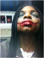
Below You will find the three trials we did on make up we did and how we made progress every time we tried. it was a really tough work as we were trying to get it perfect but as people say handwork pays off in the end and it really did.
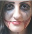
MAKE UP TRIAL 1
This was the first make up trial we did. as you can see the make up is quite not to a good quality but we did our best.

|
|

|

|
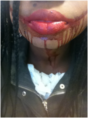
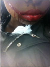
MAKE UP TRIAL 2
We quite pleased on the outcome of the second trial even though we believed that there are some things that could be added to give a good horror effect.
|
|
|
|
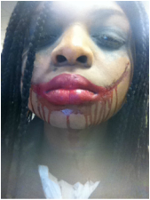
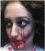
MAKE UP TRIAL 3
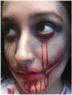
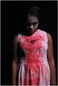
On our third trial we wanted to add something that will give a creepy and horrific feeling to the audience. therefore we decided we should make blood coming out of her eyes. after trying it we thought it suited the character and therefore we should definitely use that.
|
|
|
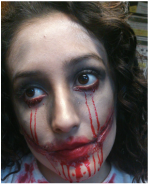
FINAL RESULTS
After all of our past three trial this is how we mad the main character make up look like and this is how she appears on the trailer. we were very pleased of the final outcome as we believed that we have achieved the quality of make up we could've done on our best.

|

|

|

|

|
HORROR TEASER TRAILER
Before creating our trailer we had a tutorial from the our media technician on how to use the camera when shooting a horror film. we tried different camera angles, and did test shoots so that when we shoot our final trailer we would not make any silly mistakes. we also tested different camera angles such as high angle, medium shot, close up and how to go out and in of focus as these would be very important when we are shooting our trailer.

When we were shooting our teaser trailer we used a professional SLR Camera which was Canon 550D. This helped providing the best picture quality as possible in making it appear very realistic. For our group it was not a challenge when it came to use the camera on the shooting of our teaser trailer as we already had tutorial on how to use at the beginning.

KINO FLO
This is used to provide the best light when it comes to shooting. when we were shooting in the e;ectric room it was very dark but kino flo was very useful in providing the best quality of light as possible and the footage came out very clear even though we had to make sure that if we use the kino flo it shouldn't appear too artificial therefore we had to balance it to a maximum standard. In order to avoid this, we placed the kino flos at the side of our subjects so the lighting would be more subtle rather than harsh.
This is used to provide the best light when it comes to shooting. when we were shooting in the e;ectric room it was very dark but kino flo was very useful in providing the best quality of light as possible and the footage came out very clear even though we had to make sure that if we use the kino flo it shouldn't appear too artificial therefore we had to balance it to a maximum standard. In order to avoid this, we placed the kino flos at the side of our subjects so the lighting would be more subtle rather than harsh.

TRIPOD
Tripod as used to stabilise and elevate the camera as well as the flash unit. this was such a benefit to us because we managed to shoot the scenes that we were all in it and nobody had to hold the camera as the tripod did this. also the tripod was quite useful when it came to keeping the camera still as we only had to connect it to tripod and start shooting while it is on it. this helped in providing any shaky footage of our trailer. lastly it helped in providing perfect framing in the final production of our trailer.
Tripod as used to stabilise and elevate the camera as well as the flash unit. this was such a benefit to us because we managed to shoot the scenes that we were all in it and nobody had to hold the camera as the tripod did this. also the tripod was quite useful when it came to keeping the camera still as we only had to connect it to tripod and start shooting while it is on it. this helped in providing any shaky footage of our trailer. lastly it helped in providing perfect framing in the final production of our trailer.

LENS
We used 18-200lens when we were shooting our trailer. it helped in providing the best quality of our clips as the will give a much clear view. in addition it gave us the option of experimenting with different camera angles.
We used 18-200lens when we were shooting our trailer. it helped in providing the best quality of our clips as the will give a much clear view. in addition it gave us the option of experimenting with different camera angles.
For us we found the production stage quite challenging us we had to make so many changes on our shooting script this included the changing of locations and some scenes. during this period we had to cancel some our location such us the adoption centre as we could not find one to use for our trailer also we had to remove some of the adult scenes as we could not find proper adults to act as the role of the two parents. As a result of this our trailer was shot in minutes but good Also on the day of the shooting the main character that we were going to use unfortunately she could not make it, therefore one member of our group had to play the main character as we could not find anyone who was free on this time to use on our trailer. All these challenges that we faced helped us to get the feeling how it really feels like when shooting a real horror film and how you have to deal with any difficulties that may rise, which for us its quite a very good experience.
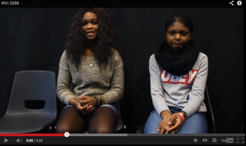
VIDEO LOG 1 - BEFORE SHOOTING
Before we did our shooting e had to a video log that we and to talk about how we think the day is going to be like. in this video log we had to talk about what we believe will go well and what we are are afraid will go wrong. we believed that the costume and make up will definitely go well but we were most afraid of was how were going to shoot some of the locations that we had such the adoption centre. doing this was very useful because it made sure each one of us know what we would be in charge of doing on the day of the shooting.
|
|
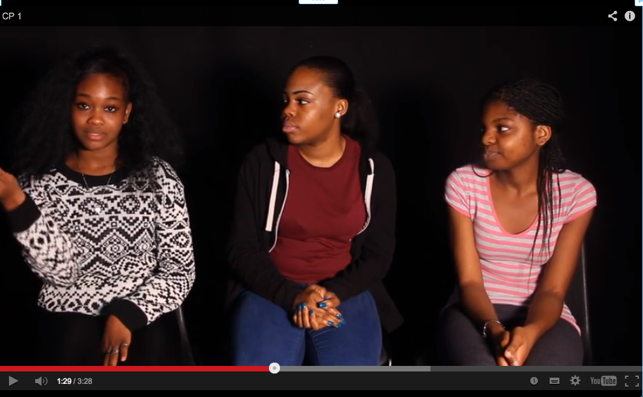
VIDEO LOG 2 - AFTER SHOOTING
After shooting our trailer, we had to do another video log but this time we had to talk about on how we think the day of the shooting went this included again talking about what went right and what went wrong. when were doing this video log one member of our group was absent(Jade). the make up and the locations went rely well even though we had to change some of the locations. what wen worn was that the person who was supposed to play the main character could not make it therefore one of our group had to play the main role.
|
|
As a form of technology we used Canon 550D to shoot these videos which is the same camera we used to shoot our teaser trailer. Overall the making of the teaser trailer was probably the challenging thing we had to do as we face many difficulties that eventually they came to a point where we felt like giving up but thanks to the encouragement from our teachers for pushing us so hard and making us achieve what we thought that it would be impossible to achieve.
Final cut pro

As a group we used final cut pro to edit our teaser trailer. this is a non linear video editing software which is developed by macromedia Inc. By using final cut pro we were able to cut clips this helped us to avoid any unnecessary footage that we didn't want. from this we also used shades that helped to separate one shot on to the next shot. In addition we were able to use some editing techniques to represent the horror theme such us making Endora flick. we also used colour control to give the fear feeling to the audience. overall Final cut pro was very useful and without it we wouldn't be able to put up our trailer together.

After looking and examining many horror trailers we noticed that there was a lot of Quick cuts used especially on the montage sections. This helped to create tension, fear and excitement to the audience which was one of the things we thought was very important. As a result we had some quick cuts on our trailer, As we believed they were very effective to the audience and because it represented the horror genre at it perfection.

Using transition was one of the important things that we believed we have to used in our trailer. This is because it helped to separate two shots into another. The transition that we thought it would be good was "Fade to black" as this would create quite tension to the audience about how the next scene will be. furthermore by using transition, it shows that we have researched and we know where it would be good to use them.

Captions are used to make the audience understand what the film is about. According to our own research that we did, we saw how effective captions can be when used in horror films as it also helped threader know the plot. when we were doing the captions we had to find a background. finding a background was quite of a hard thing as we had to find a background that would fit the mood. Finally we able to find a dark wall background from google that we ended up using it. Similarly picking the right fonts for the captions was an issue as there were many fonts that we preferred but we ended up choosing the one that fitted the background properly; this font was "Birth of a Hero". we also added some transition on the words to make it zoom in and out we also did the same to the background. combining both of these created such a weird feeling which was exactly what we wanted.

Finally we used colour corrector. this helped to bring in different
tones and colours to make our shots obtain an eerie look. it also
helped us enhance the images.
tones and colours to make our shots obtain an eerie look. it also
helped us enhance the images.
SOUND
SOUND TRACK PRO

Sound track pro was used whe we were creating the sound for our teaser trailer. this is a music composing and audio editing application created by Apple Inc. this icnluded different range of sound effects that we were able to listen and to choose, building up to our final sound.
|
|
Before we started making our sound we watched different trailers and we listened to how effective their sound was. this gave us a clear idea on how our sound should be like. the trailer we lookled at was "The devils reject" in this film we liked how the sounds starts with a slow motion with some tensions and the n builds up to create even more tensions especially on the quick cuts. the sound of this trailer was also used on our storyboard animatic. when we were creating our final sound we used this traile's sound as guide of creating our own sound for the teaser trailer. we choise this trailer as our guide because we wanted our teaser trailer to have the same pacing as it would represent the horror genre as it should be. |
|
On Sound track pro we listened to different sounds such as "church bells" and and "explosions" as there were some parts of our trailer that these sounds were needed and therefore we belkieved it would be good if we use them. we also listen to other slow tyoes of wounds as we wanted our sound to not sound quite similar from the beginning to the end as this would not create any tension or fear among the audience. furthermore we mixed some sounds together by laying on top of each other so that it can create ceratin emotion and effect.
|

|
|
Apart from using sound track pro we also experimented with Garage band. inn here one our group member creted a piano sound that sounded very creepy. however we did not use this as it did not suit with the trailer mood or some of the shots. Even though we did not use the sound that we created on here but it was still a good experience to us because then we knew what types of wuld not be suitable on our trailer.
|


|
Lastly we used a website called free sound. this is a reposity of creative commons licensed audio sounds. on here we listened to different sounds as we were trying to find a fast beat that could be used on the quick cuts. Even though we did not find any good fast beats we were able to find the right sound that we coud use as our backgorund noise.The background noise that we chose was "whispers" as we believed that it gave such a creepy and fear feeling therefore it would be effective to the audience.
|

|
MOVIE POSTER AND MAGAZINE FRONT COVER
When we were thinking about our magazine posters and movie poster we did a lot of research on different techniques that could be used. for example we looked what shots would be suitable and what other things could be included. we also looked at real existing magazine front cover4s and posters conventions as a guide of making our own final products.

when we wanted to do our poster, we had to pick an image that it will clearly represent the film and whats its about. therefore we took different images and at the end we chose to use the main character image as the main image on the poster. we tried different shots of the main character until we had the right one.
this one the best image we liked and we decided that we were going to use it for our poster. it worked out really good. her face been lit on one side creates a very horrific look which was what we were aiming for.
|

This image has captured a good face expression from the main character, but we did not use this image because it was out of focus even after trying to enhance it on photo-shop.
|

This image had the best light as we used the kino flo to produce more light. this helped the main character's face to be more invisible to the audience.
|

After we shot the trailer, we thought we could use a different person for the magazine front cover and poster.
But our teacher told us it wont look professional because we have used a different person so at the end we ended
up using the person who was in the trailer.

When we were constructing our magazine front cover and poster we used the editing app photoshop CS6. This is a graphics editing program developed and published by adobe system. Using photoshop at this stage was not a challenge for us as we have used it before when were making our music magazine front cover and content page in our AS Year so this was very useful. with photoshop we were able to give our magazine front cover and poster a professional look at its best. some of the things that we had to change was the contrast and brightness of images on both products.

|

|

|
Before we started constructing our poster we did some research on some existing real poster. as we wanted to use their conventions as our guide to making our own. we searched for "Carrie" different posters and "The host" as this had the same conventions of what we were aiming to achieve because they all seem to position the girl on the middle looking straight at the camera.

Before we put the main image on the poster We had to structure everything first. For example the credits, The Title and everything else had to be in line as everything else. as this would give a proffessional look on the poster. we had to leave a big space because the main image was going to be a medium look

When we were looking at real existing posters we noticed that they tend to use the black colour as their background. therefore we believed this would be very good if we use the background as it will make all the words stand out which means the audience can read the information on the poster without any problems.
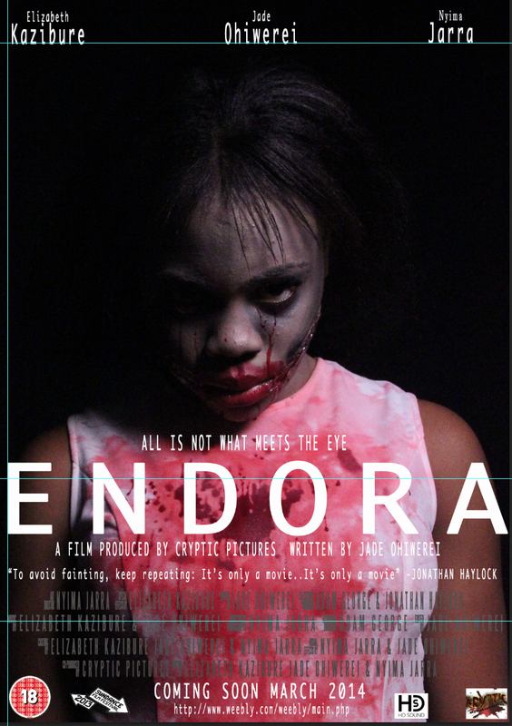
This was the first stage, of our poster, as you can see that it does not look like a professional poster because it looks too basic.
|
On this stage, our poster started to look more professionally. by using photoshop we were able to add the black shade behind the credits so that it won't be hard for the audience to read.
|
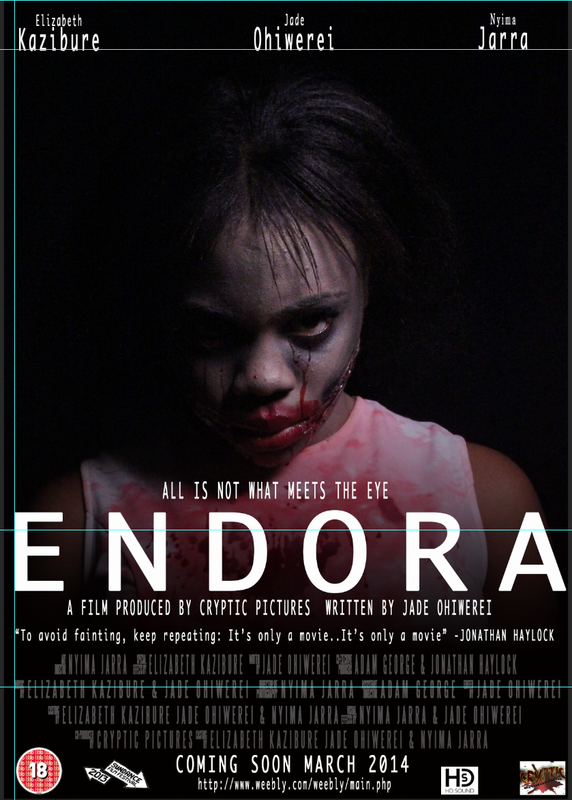
This was our final poster. we made a lot of changes comparing to the last stages such as the names above we decided the surnames needs more bigger than the first names, the credits need to be a lot smaller, we also changed the font of the main title as this one looked more presentable.
|

After finishing the poster, we started constructing the magazine front cover. we used the app photoshop CS6 as well. as one of our coursework rule we were required to use the same font used from the poster to be used on the magazine poster. in order to get the professional look we had to follow all the magazine conventions that were required thi prevented our magazine to have the unproffesional look.
We decided that the background of our front cover should be black. this would give the main image to stand out which would result for it to be attractive to the audience. to paint the background black we used the paint bucket tool.
All the fonts that we used on our magazine front cover and poster were found already on photoshop therefore we did not have to download any fonts from websites such as Da font.
CONCLUSION
Overall this assignment ha taught us so many things. from learning more about technology and how the real film industry work top ho w to work in a team. we have gained o many skills such us how to shoot an effective film and what important things need to be included when making a horror film trailer, poster and magazine front cover. we have also learnt on how to control the light in different ways such as by using kino flo to produce more light to subject. During this assignment we also learnt how to use final cut pro and sound track pro which are two apps that were new to us as we did not use these at our first year of AS Media studies. Media technologies have been very useful from the beginning of our coursework to the end and without it we would not have been able to construct our final product.
