TEXTUAL ANALYSIS

Textual Analysis: Magazine Cover
Mise en Scène:
Lighting- The lighting is low and dark. This is a contrast from the text which is a complete opposite.
NVC- The malicious smile on the girls face shows her to be sinister and no good. Her face is heavily wounded with deep cuts and bleeding but this doesn't seem to faze her at all. Her teeth are yellow and covered with blood this raises the question as to what kind of evil person she may be.
Setting- The setting cannot be seen as it’s a plain dark/black background.
Costume- The girl is wearing a white dress which again is a contrast to her character as she looks evil. The colour white represents purity and innocence, two characteristics she does not inhabit.
Props- There are no props.
Camera Angles: The main image of the girl is a medium long shot. Her positioning is symmetrical to the cover.
Text: The typography is all capitalized however the cover lines are distributed asymmetrically around the lower part of the cover.
Masthead (Logo): The name of the magazine is ParaCinema (Paranormal Cinema). The font is a bright yellow which is immediately eye catching also the type of font used seems to have a horrific effect.
Dateline: The dateline is not located on the cover.
Main Image: The main image of the girl makes eye contact to the reader with her piercing yellowy-green eyes. Her pupils are very small and there is a dark black outline around them making it seem even scarier. Another eye catching part is the deep wounds on her face and her very wide smile and blood stained teeth. It’s a very busy main-image but fulfills its genre of horror.
Model Credit/Cover Line: The model credit/ cover line is ‘The Exorcist’. This makes reference to the main image of the girl as she is from the movie ‘The Exorcist’.
Cover Line: The surrounding cover lines are: ‘The Woman’s Issue’,’Films’ and ‘Frankenhooker’. These cover lines explain what is going to be in this issue of Paracinema.
Left Third: The left third contains the cover line ‘The Woman’s Issue’ that maybe the important selling point of the magazine as it may want to appeal to female readers.
Bar Code: The barcode is located near to the spine of the magazine.
Textual Analysis: Poster
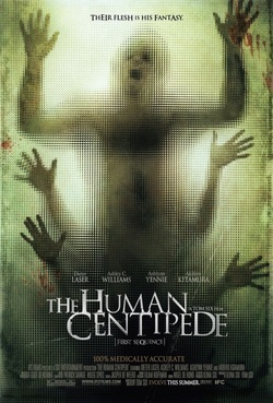
Film Title: The Human Centipede
Year of Release: 2010
Director: Tom Six
Film Orgin: Sequel
Production/Financing Company: Six Entertainment
Principle Cast:
· Dieter Laser as Dr Josef Hieter
· Ashley C. Williams as Lindsay
· Ashlynn Yennie as Jenny
· Akihiro Kitamura as Katsuro
Synopsis:
Dr Josef Hieter is a world renowned expert at separating Siamese twins but has always pondered on creating a somewhat ‘centiepede’ involving the joining the mouth to anuses oh humans forming a ‘Human Centipede’. He holds hostage three victims (Lindsay, Jenny & Katsuro) and drugs them to begin his sick venture. Eventually the Doctor Hieter is fatally shot in the head, Katsuro commits suicide feeling he has dishonoured his family, Jenny dies due to blood infection leaving Lindsay as the last girl.
Conventions:
The poster follows a simple but effective design. It is evident the sub-genre of the film is psychological horror judging by the excruciating expression on the persons face and that’s followed by two pairs of hands somehow attached to them. The lighting are low adding to the dominance of the bodies attached to each other and also the blood stains also add effect to the gore and horror that the movie may contain.
Mood:
The movie portrays a gloomy and frightening mood with an acknowledgment of the searing pain they may be feeling.
Font Names:
The presentations of the stars of the movie are minimal and abstract. This makes the movie as a whole more important than the cast itself. Their names are spread across the poster in a non-distracting manner.
Credits:
The credits are located at the bottom of the poster in faint white writing.
Colours:
Contrary to many horror films the colours used are quite bright. However, this is used to the advantage to the movie making it shock and scare the audience even more.
Mise en scène:
Lighting- The lighting is low and simplistic and theme is soft yet mysterious.
NVC- The expression of the persons face screaming tells it all. It expresses sheer and scrutinising pain. Those who don’t have a high tolerance of pain are not advised to watch this movie.
Setting- The setting is blurred so it is unknown.
Props- There is no props, maybe only the blood stains.
Textual Analysis: Trailer
Film Title: The Conjuring
Year of Release: 2013
Production/Financing Company: The Safran Company
Link: http://www.youtube.com/watch?v=ejMMn0t58Lc
Principle Cast:
· Vera Farminga as Lorraine Warren
· Patrick Wilson as Ed Warren
· Lili Taylor as Carolyn Perron
· Ron Livingston as Roger Perron
· Joseph Bishara as Bathsheba
Film Origin: Not Known.
Synopsis:
Ed and Lorraine Warren are renowned Paranormal Investigators who go to homes and investigate paranormal mishaps and occurrences that are unexplainable. They find the source of the problem which is normally a possession and in partnership of the Catholic Church banish demons. In their worst and most secreted case they were called to the Perron household, a family of five girls, Mother and Father. After a great deal of haunted behaviour the Warrens find that a powerful demon named Bathsheba has abused the daughters, inflicted bruises on to the Mother and ultimately possesses the Mother into almost killing two of her daughters.
Conventions:
The Conjuring is a Supernatural Horror film which is evidently depicted in the trailer. The sudden and unexplained noises and figures are appropriately manipulated to shock and scare the audience. It continues the simplicity of the poster and has also achieved its expectations of scaring the hell out of the audience. I personally know that.
Genre: The genre is Supernatural Horror.
Narrative: The trailer doesn’t contain any narratives rather that the music tells the story.
Location: The location is shown to us to be an old fashioned farmer house as the movie was set in the 1970’s. The house can maybe serve as a character as the house explains the story as to why such mishaps were taking place.
Characters: The trailer depicts the character of Carolyn Perron as she experienced the full throttle of the demon Bathsheba. Carolyn was Bathsheba’s victim as Bathsheba possessed her to carry out her evil.
Voice-Over: There are no voice overs.
Theme: The setting of the movie is the 1970’s so the theme is simplistic and rustic as technology wasn’t as advanced as it is now. This could have been seen as a challenge to executing the scary scenes as their use of technology is limited bearing in mind it was made in 2013.
Pace: The pace of the trailer at first was upbeat, cheery and normal. However towards to the middle and the ending of the trailer the pace was quick and sudden to infiltrate fear.
On-Screen Captions: None.
Editing & Post Production Effects: The sudden cut of the camera leaves the audience unprepared for what is about to happen leaving them vulnerable and the climax to a hair rising scare. For example, when Carolyn was locked in the basement and used the match for lighting her surroundings then suddenly a pair of hands clap behind her.
Music: The music used at the beginning of the trailer was The Zombies- The Time of the Season which is cheery and a feel good song but that comes to an immediate stop when we see again the mysterious hands clap in the wardrobe and when the pictures mysteriously fall to the ground etc.

INSIDIOUS
NAME: INSIDIOUS
GENRE: HORROR
YEAR: 2010
DIRECTOR: JAMES WAN
MAIN CHARACTERS: PATRICK WILSON, ROSE BYERN, LIN SHAYE, BARBARA HERSHEY
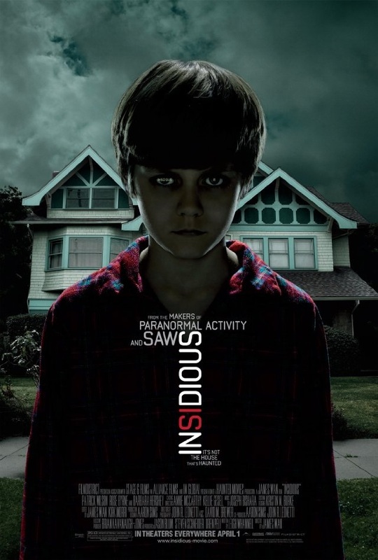
TITLE: The title is the name of the film that is being advertised, its readable which is good for the target audience, the title is also written vertically which might represent the spirit rising from the ground to the top.
MAIN IMAGE: The main image is of a house, this might connote it’s the main building that involves the story also where the main actions happens. The four paths on the road might connote being lost and there’s four ways but you are unable to pick the right one. Also the way the house is being represented, is as if no one leaves inside it, because it has a very lifeless look.
COVERLINES: There are other coverlines behind the title that the same film makers of insidious have made. The main purpose of this is to influence the audience that it is as good as their other films so they should go and watch it.
COLOUR: the colours used on the poster are very dull which gives it a looks as if it’s going to rain because the clouds are quite darkish, in addition the colours gives a feeling to the audience of being trapped in a place where there’s no help you can get from anyone or anything.
MOOD
the mood on this movie poster creates fear and loneliness because of the location, but it also brings the worried mood to the audience because of the colours used, also from the picture you can sense that the atmosphere is supposed to be quite ch
CREDITS
the credits are written at the bottom of the page in a very narrow writing which makes it harder to read, but it doesn't interfere with the main image which is probably the main attraction to the audience.
SETTINGS:
the setting looks like an area where its not loud or chaotic like in the city, therefore the location shown on this movie poster should be countryside as it is likely for people to leave in a house than a council flat.
NAME: INSIDIOUS
GENRE: HORROR
YEAR: 2010
DIRECTOR: JAMES WAN
MAIN CHARACTERS: PATRICK WILSON, ROSE BYERN, LIN SHAYE, BARBARA HERSHEY
TITLE: The title is the name of the film that is being advertised, its readable which is good for the target audience, the title is also written vertically which might represent the spirit rising from the ground to the top.
MAIN IMAGE: The main image is of a house, this might connote it’s the main building that involves the story also where the main actions happens. The four paths on the road might connote being lost and there’s four ways but you are unable to pick the right one. Also the way the house is being represented, is as if no one leaves inside it, because it has a very lifeless look.
COVERLINES: There are other coverlines behind the title that the same film makers of insidious have made. The main purpose of this is to influence the audience that it is as good as their other films so they should go and watch it.
COLOUR: the colours used on the poster are very dull which gives it a looks as if it’s going to rain because the clouds are quite darkish, in addition the colours gives a feeling to the audience of being trapped in a place where there’s no help you can get from anyone or anything.
MOOD
the mood on this movie poster creates fear and loneliness because of the location, but it also brings the worried mood to the audience because of the colours used, also from the picture you can sense that the atmosphere is supposed to be quite ch
CREDITS
the credits are written at the bottom of the page in a very narrow writing which makes it harder to read, but it doesn't interfere with the main image which is probably the main attraction to the audience.
SETTINGS:
the setting looks like an area where its not loud or chaotic like in the city, therefore the location shown on this movie poster should be countryside as it is likely for people to leave in a house than a council flat.
MAGAZINE FRONT COVER TEXUAL ANALYSIS
STORYLINE:
The storyline is about a child being haunted by a demon. The family believes it is the house but it’s actually the child. While the child is asleep his soul escaped from his body in to a different world or dimension in which demons and dead people leave. This gives the demon an opportunity to possess the child’s body and cause pandemonium on earth killing people. The longer he is asleep the easier it becomes for the demons to inhabit his body.
MISE EN SCENE:
Insidious covers many aspects that a normal horror film will include such as the costume, location, props and people. The trailer consists of a location of a middle class house in a very respectable and quite neighbourhood occupied by a regular loving family. This is then turned that the house is being haunted by a demon. They used props such as chairs windows beds and hospital equipment’s throughout the trailer. The bed is most important crop because it aids the plot of the film, in order for the demon to get into the mortal realm, he must pass through the child’s body when he’s is sleeping.
CAMERA: There is a variety of camera shot and angels used in the insidious trailer. They are all used to build up tension and pace as well as represent a certain thing such as a close up of the metronome which is used in the film to hypnotize the father. There is an eye-line medium close up of the distressed fa6ther which is a very powerful shot as it shows the characters facial expressions and emotions as well as giving the affect that he is looking straight at you.
EDITING: The definition of insidious is proceeding in a gradual subtle way causing harmful effects, as the words cross dissolves into each other which will enhance the feeling of fear to the audience. There are many diegetic sounds throughout the trailer such as loud collisions, screaming and slamming of doors, there is a medium shot of a metronome of which is used to hypnotise the father, the sound of the tick tock then plays throughout the trailer, which creates an image that time is limited as the sound mimics the sound of a clock.
GENRE: The film trailer is certainly a horror film as it has all the conventions that the audience would expect. Horror films can then be categorised into sub-genres, the films deals with demons, spirits, and sci-fi parallel universe so it has many sub- genres such as religious due to the demon, but as it has a science fiction input it is quite hard to categorise this film as it deals with several sub genres.
LOCATION: it is all set up in one location which is the house, as every action happens in it.
POSTER ANALYSIS
FILM TITLE: INSIDIOUS
RELEASE DATE: 2011
DIRECTOR: JAMES WAN
AIN IMAGE: the first thing you notice when you look at the poster is the strong eye contact between the boy and the camera, to engage and grab the attention of the audience.
LIGHTING:The lighting used on both the boy and the background is very limited; suggesting that perhaps is life or world is surrounded by darkness.
MOOD: The dark clouds perhaps represent his state of mind or emotions; doomed, lost and obscure.
The main image is positioned right in the middle, making the character the main focus of the magazine. From this we can straight away understand that he is the main character of the movie.
The boy seems to be wearing a night gown, suggesting that whatever is happening, is taking place at night time.
THE DEMENTED in the beginning of the trailer, quick shots were used, showing a bunch of teenagers having fun in the woods. In the beginning of the trailer, a very lively and off beat music was played in the background indicating the characters as fun and adventurous people. The music change to what seemed to be a warning sound and a close up shut was straight away use to show the expression of worry on the girl’s face. From this we could straight away see that something is gone wrong.
The stereotype of women being weak, emotional, startled and vulnerable is extremely exaggerated in the trailer. After the first five seconds of the trailer, any time a female is shown, they are either crying, screaming or extremely terrified. O the other hand, the male in the trailer are shown either fighting or protecting the female from being killed, which are topical stereotypes of what men should and expected to do.
The stereotype of women being weak, emotional, startled and vulnerable is extremely exaggerated in the trailer. After the first five seconds of the trailer, any time a female is shown, they are either crying, screaming or extremely terrified. O the other hand, the male in the trailer are shown either fighting or protecting the female from being killed, which are topical stereotypes of what men should and expected to do.
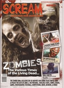
MAGAZINE ANALYSIS
Unlike most magazines, quite a variety of really bold and strong pictures are displayed which instantly identifies the magazine’s theme. Most of the images used on the magazine, are close-ups, giving us the chance to see the exaggerations of the expression on the models’ faces. This creates an effect of fear on the viewers.
MASTHEAD: The masthead is not extremely exposed on the magazine, like other magazines but still stands out because the font used is very chilling and it’s the only text in red, that really stands out from all the other tests.
COSTUME: what they are wearing is not revealed in full details, but from the main image, we can see black clothing, associating the theme with death, mystery and evil.
